There, I said it. I am on a course to offend everyone who designs for a living and has their office/shop in Bagbazar. How can a place or a locality gain so much infamy? How can a style of design be mocked and laughed at over and over gain? How we, judge someone’s design and call it “Bagbazar”. We come off as douchebags in saying so, but it’s impossible to deny the fact that Bagbazar in itself is an ecosystem, a living, vibrant community of designers who have quite well, made a niche of their own.
So first things first. Where is Bagbazar? Bagbazar is densely populated neighborhood in Kathmandu, with lots printing services available in almost every second shop. It’s like a print and publishing market.
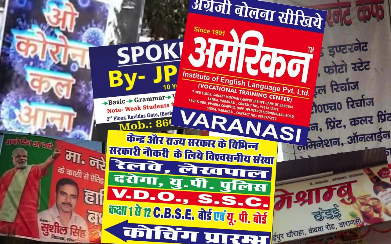
Then what is a “Bagbazar design”? The answer is subjective. There is no definitive answer – but anything that uses loud jarring colors (mostly primary colors), heavy patterns or ornaments (mostly from 2004), uses one of the default fonts that ship with Windows (eg. Brush Script, Calibri, Impact, or Comic Sans) and excessively uses stock photography (mostly white people to sell very Nepali things). Again, this is not an exhaustive case, but some examples are shown below:
 You see it everywhere. You don’t really need to go to Bagbazar to see this style of design, but if you put a keen eye, you might just see it in a magazine on your table.
Why the infamy?
This style of design is notorious and you see it everywhere. You see it on sign boards, on brochures/flyers, books — you name it! Slowly it has even creeped its way into social media and digital marketing. Mostly, this style of design lacks aesthetics and is solely focused on conveying the information. The designers do it because that’s what they do day in and day out, and the customer base loves it. People love bright colors in Nepal and loud aesthetics wows them. You step into an average living room of any suburban Kathmandu home and you’ll know what I mean — the wall colors, the laces, the furniture-to-wall color contrast. It’s often overwhelming to us, but they love it. They love the style, that’s why it’s so popular and it has survived.
How did Bagbazar design happen?
Many years ago, I had the opportunity to work with a person who had spent his life working in printing and publishing. I asked this question to him — why do these designs look like these? He acknowledged my curiosity and gave me a wonderful revelation.
During the early days in Nepal, there was no printing services available. Printing was mostly done in India; mostly Banaras (Varanasi). All the books, magazines, and posters were developed and printed there. Print shops here took orders and did the delivery. Slowly, these print shops invested in printing and brought home the first batch of printing machinery — but they ran into a problem. They needed human resource to do the typesetting and illustration: so they sent their staff to India for training. When these men returned, they brought home what was the Banarasi style of design (which is still prevalent if you see local Indian designs). This slowly evolved into its own style, infusing local styles and sensibilities – which we now know as the Bagbazar style.
 This style of design is seen across Northern India.
Fast forward to the age of computers, and most importantly Macromedia Freehand, the go-to design tool for designers in Bagbazar. Freehand revolutionized the way desktop printing happened. Suddenly printing presses were equipped with a Swiss-knife tool that could do anything: from screen films, to posters, to brochures to business cards. Freehand could do everything and they loved the ease of use. Devnagari script worked like a charm! Please be aware that Adobe bought Macromedia in 2005 and merged Freehand into their Illustrator and InDesign software. However, when I checked last time in 2017, designers in Bagbazar were still using the last available version of Macromedia Freehand that was released before the company went defunct.
Today, most of them have slightly upgraded to Adobe Illustrator but the aesthetics remains pretty much the same. They don’t use fancy fonts — they just pick one that comes with the operating system. They mostly stick to the basics of color, producing only true reds (0c50m50y0k) and true blues (50c50m0y0k) and never really crossing the boundaries. They will use only print safe shades they’ve known will work in the machine. Your flat color palette is not going to work with them, so keep it to yourself.
Why don’t they upgrade their tools and skills?
Simply, because they don’t have the time. These design “factories” work at a tremendous speed – their objective is to get the design from idea to printing in the least possible time. So they do not have time for an update or an upgrade. Even a slightest learning curve means delay in production and that’s something they cannot afford. It’s not really “design” design if you may, and the whole business exists on the principle of how quickly you can get the printing done. That’s the reason why designers working here don’t really elevate their skills. They come in having learned how to operate a software and can go like that for decades. There is nothing to innovate, no one to impress — that’s the reason why their aesthetics are stagnant. They’re outdated and they’re very very generic. It’s designed that way, and carved with constant interactions of decades. You cannot change that, neither can they.
Final notes
There is no need to laugh at or mock someone who comes from that schooling. They’ve been trained to work that way. After years and years of doing the same thing, the skill becomes a part of you, a part of your identity. That’s the case for them, even if they want to, they cannot change their style, a style that’s forever been high in demand. The only difference is that we’re at a different end of the spectrum, and we must learn to appreciate and accept the people at the other end. There should be no conflict, no overlaps and these two communities should get to coexist peacefully, without disrupting one another.
Bagbazar Design is a real thing and it is here to stay. Peace.
